Whether you’re painting your bedroom, looking for design inspiration for the kitchen, or picking out the perfect curtains, getting the right color matters.
Home design is an art, and knowing your teal from your turquoise and your cyan from your aquamarine, etc., can help you pick out the perfect palette to show off your space.
If you’re leaning towards blue, congrats! You’re right on-trend. This popular color is having a moment and no wonder – with so many shades to choose from, you can easily find a blue that suits your mood, your home, and your budget.
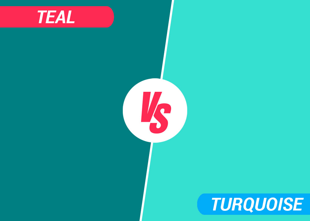
As you may have guessed, two of the most popular blues are turquoise and teal. Similar, but with a few distinctive differences, these colors are frequently confused. In this article, we’ll give you all the info you need to tell them apart and figure out what’ll work best in your home (or your life)!
Teal vs turquoise: what’s the difference?
Teal and turquoise may be considered part of the blue spectrum, but both incorporate shades of green – which explains why they are sometimes mistaken for each other.
Teal
Teal takes its name from a bird, the European Teal, that is instantly recognizable thanks to the stripe of dark blue-green down the center of its head.
Darker than turquoise, teal is a medium blue mixed with medium green. It’s a moody color, but with the right pairings and furnishings can be used to uplift a space or give it a sophisticated air.
Tips for using teal:
- For an elegant look in your living room, pair teal with gold fittings and furnishings.
- In the kitchen, teal really pops with marble countertops and/or backsplashes.
- Teal can be a soft, calming color, so it’s a good fit for the bedroom. Color one wall in teal and keep the others neutral for a restful night’s sleep.
- Going for luxury? Pair muted teal with soft whites and greys for a classically stylish look.
Turquoise
Turquoise is lighter than teal, much brighter, and more eye-catching. First popularized in interior design in the 1960s, turquoise is having a welcome comeback.
Tips for using turquoise:
- Turquoise is a fun color so put it somewhere it can shine. This shade works in quirky kitchens, airy dining rooms, and busy family dens.
- Go all-in with turquoise by pairing it with equally zany colors. Team it with pink, orange, or red to create an uplifting ambiance.
- Like most blues, turquoise is a natural pick for the bathroom. Pair it with neutral colors to keep things simple.
- Bright turquoise works well in rooms that don’t get much light, so use it in those areas of the house prone to shade.
- Go easy on the extras – turquoise will do the work for you, so you don’t need a lot of accessories or art to dress it up.
Teal vs turquoise vs cyan vs aquamarine vs mint
If turquoise and teal aren’t doing it for you, let’s explore some other varieties in the blue/green family.
Cyan
Often mistaken for teal, cyan is another dark blue/green that’s similar to aqua.
This shade loves cozying up to bright reds, sunny yellows, and deep magenta.
Aquamarine
The color of the Caribbean sea, aquamarine is a great choice for beachside cottages (or homes that want to be like beachside cottages).
Use this tropical hue in bathrooms, sunrooms, and anywhere you want to bring the outdoors inside.
Mint
Mint is a cool green not far from the blue spectrum. It can be chilly, so pair it up with hot colors like fiery red, bright turquoise, or even rich gold.
If you want to lean into the cool vibes, double down with pale blues or match it with another pastel green. This combo works well in hot climates where a cool house is a must in the summer.
In summary
There’s plenty of choices when it comes to blues. Both turquoise and teal can give your home that special something, transforming it from boring to beautiful with just a swipe of a paintbrush.
Dark teal has depth and weight, adding a sense of calm and restfulness to your space.
Cheerful turquoise is a guaranteed mood-booster, promoting positivity and optimism.
And, of course, you can always mix and match these complementary hues (the same goes for cyan, aquamarine, and mint), so go on… get creative!
After all, our homes are never just one thing. They’re a safe shelter, a cozy comfort, a place to rest, and the backdrop to cherished family memories.
A well-designed house reflects all of these things – it might not quite be there yet, but playing with your color palette is a perfect place to start!


